CTRL


...
Market context
Scope: Research & insight > positioning, strategy & TOV > brand system, brand guidelines > website.
Sector: CRM / Tech
One of the most important factors in business is the relationships we have with our clients/customers–keeping in touch with them and keeping track of our conversations. There are many CRM platforms that offer ways to communicate, store information, plan, collaborate, and organise workflows etc. But increasingly, users face information overload, missing key pieces and spending more and more time flicking between CRM platforms.
CTRL was founded to solve this problem; to deliver a cutting-edge product with simple usability and a killer user experience. Its platform enables people to access and unify client information that matters from multiple SaaS sources into a single formatted view.
Challenge
CTRL integrates all the tools you and your teams use. Allowing users to organise workflows. To prioritise conversations. To see teams' content in context. The platform was under wraps and in development when we met CTRL.
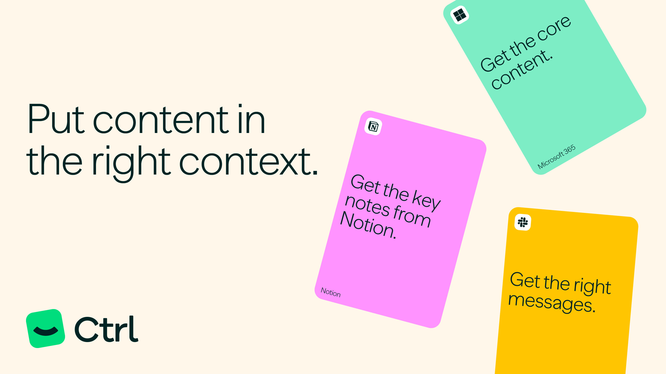
Our challenge was to illustrate how the platform works at a conceptual level without real screenshots. We were briefed to ensure the brand and design solution encouraged self-serve and ultimately product-led growth. The call to action at launch was to build a list of interested early-adopters.

There’s a smarter way to know.
The proposition is born from the ultimate value CTRL brings to the user. Its ability to connect every touchpoint puts them in control of the information, their workflows and their time.
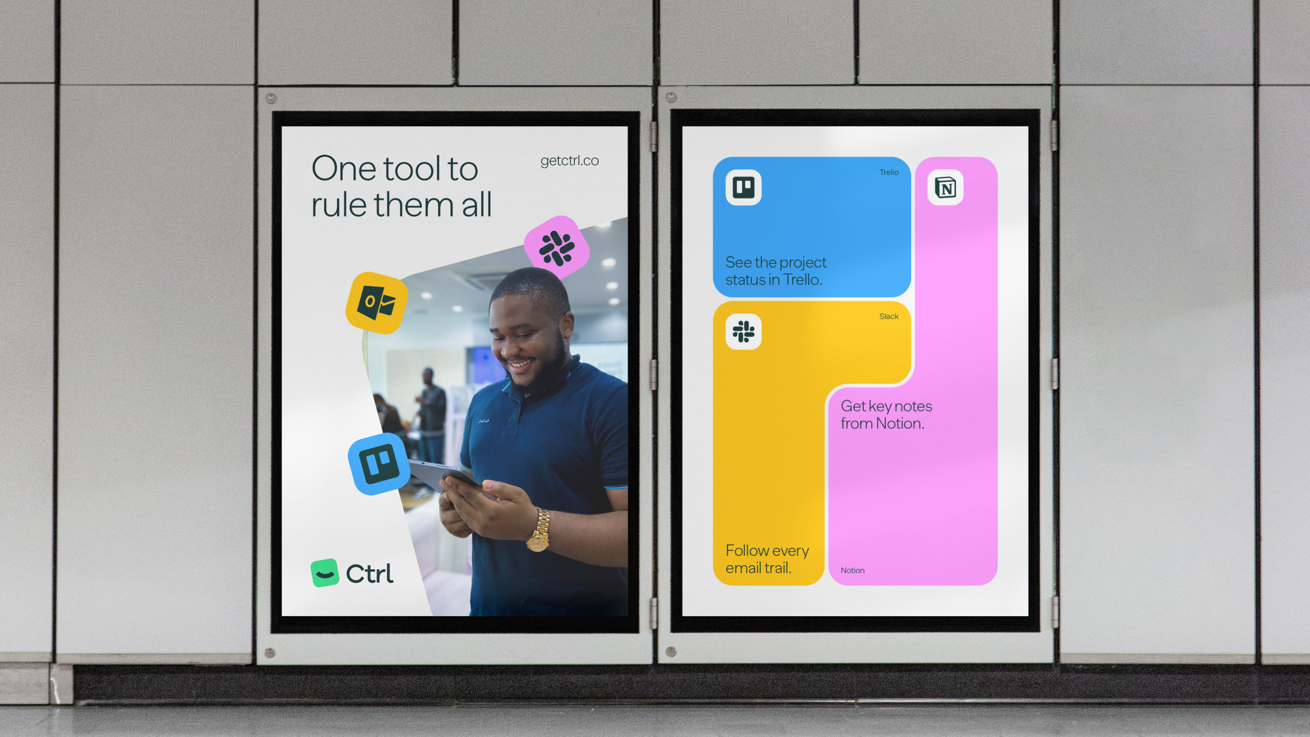
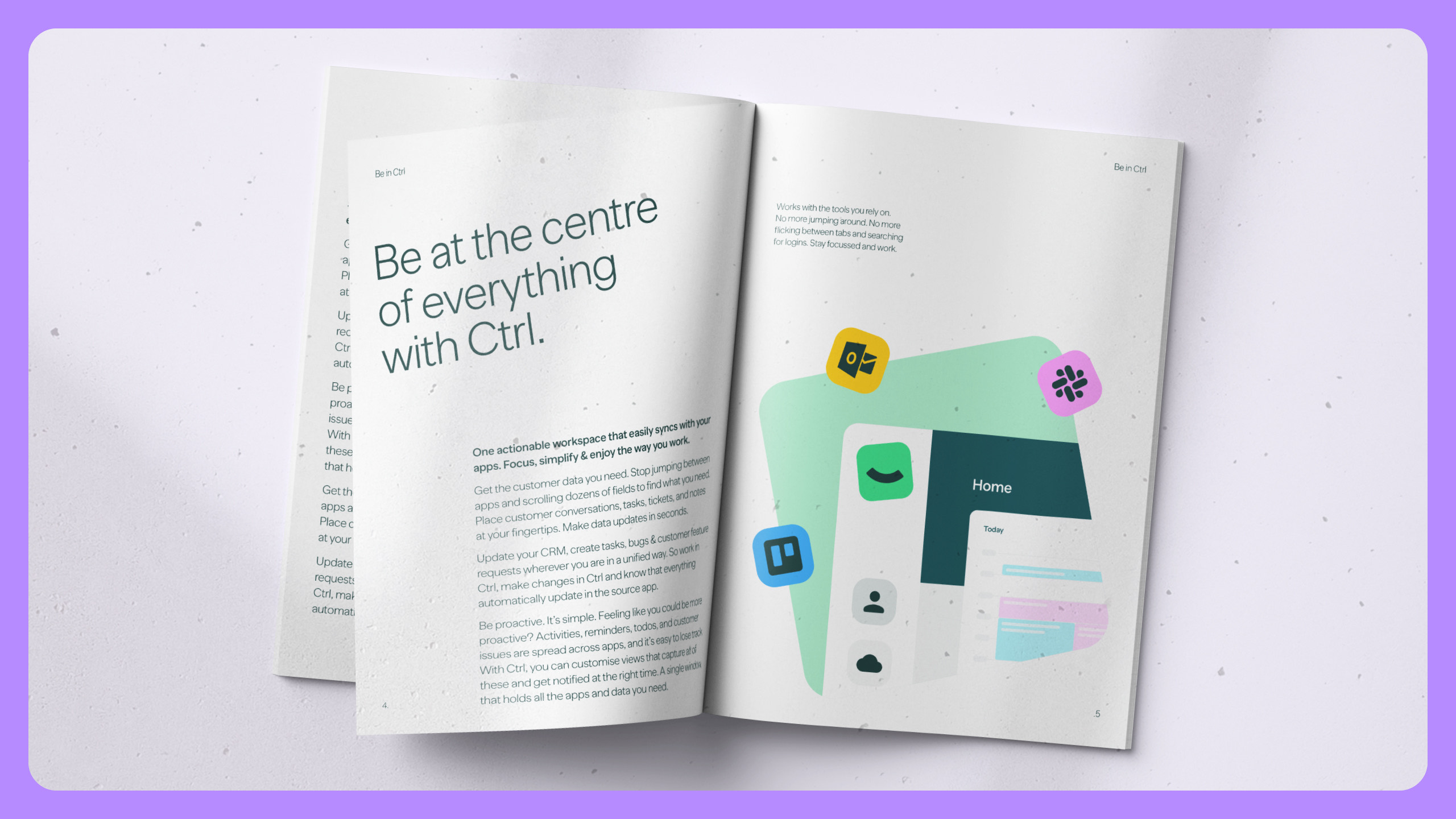
So, no more jumping around across platforms. No more flicking between tabs and searching for logins. CTRL helps people to stay focussed and work in context–there's a smarter way to know.
The tagline, Be in Ctrl, communicates the proposition and positioning simply to external audiences.
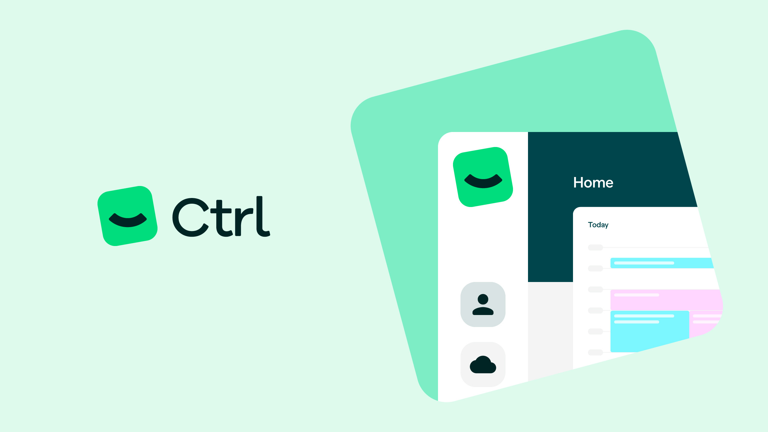

We created a visual and verbal system that reflected the
intuitive nature of the platform.
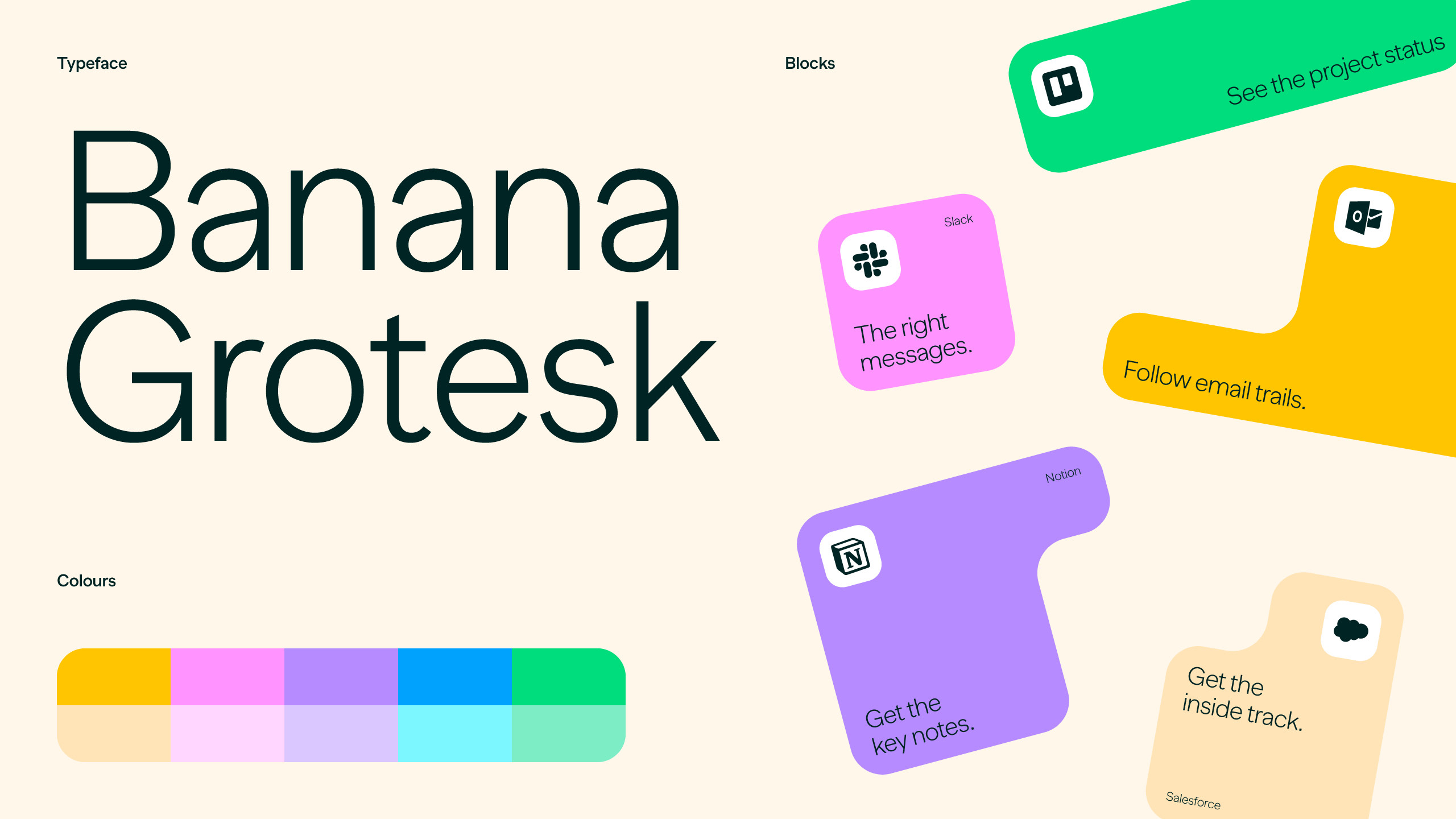
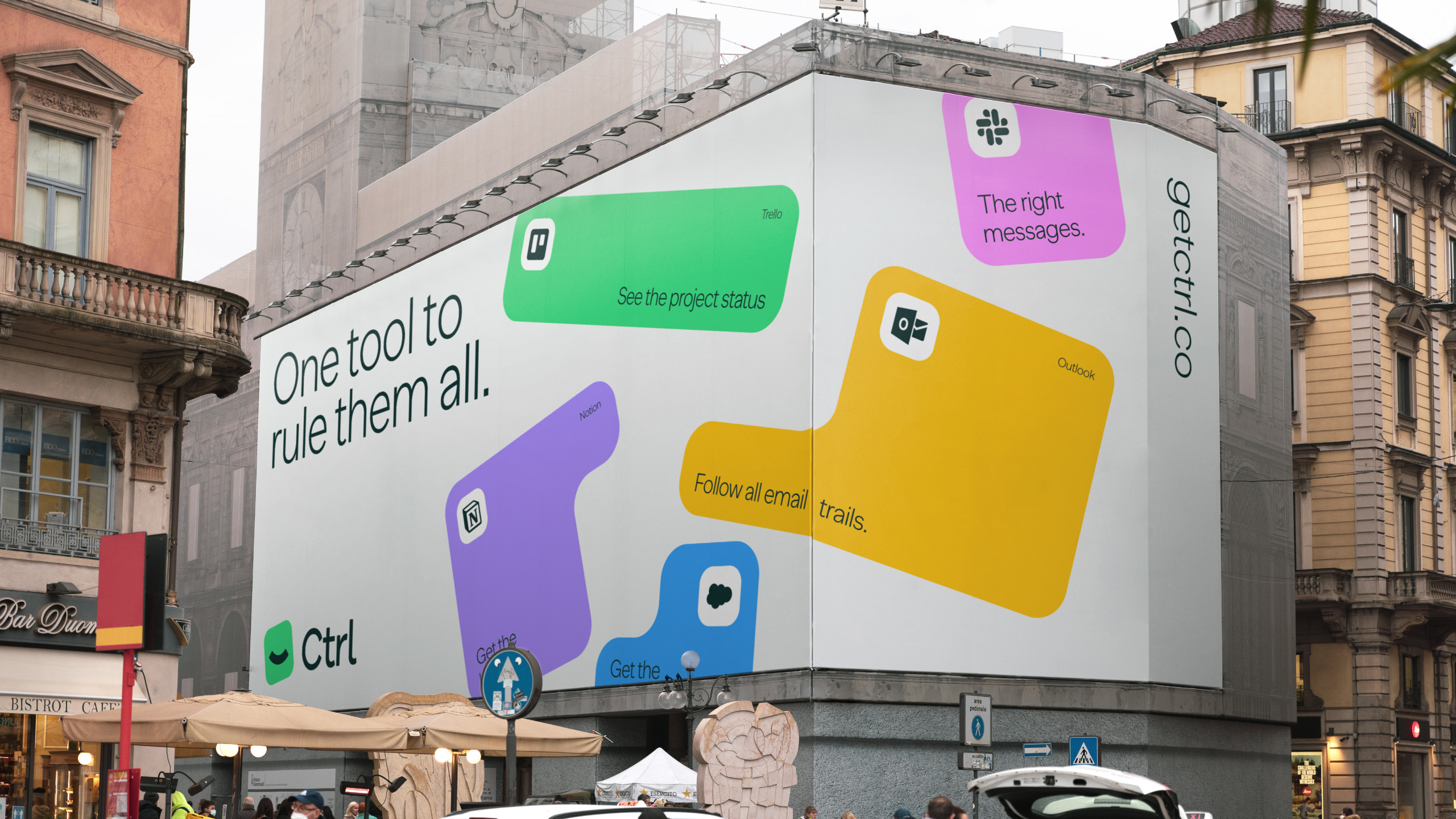
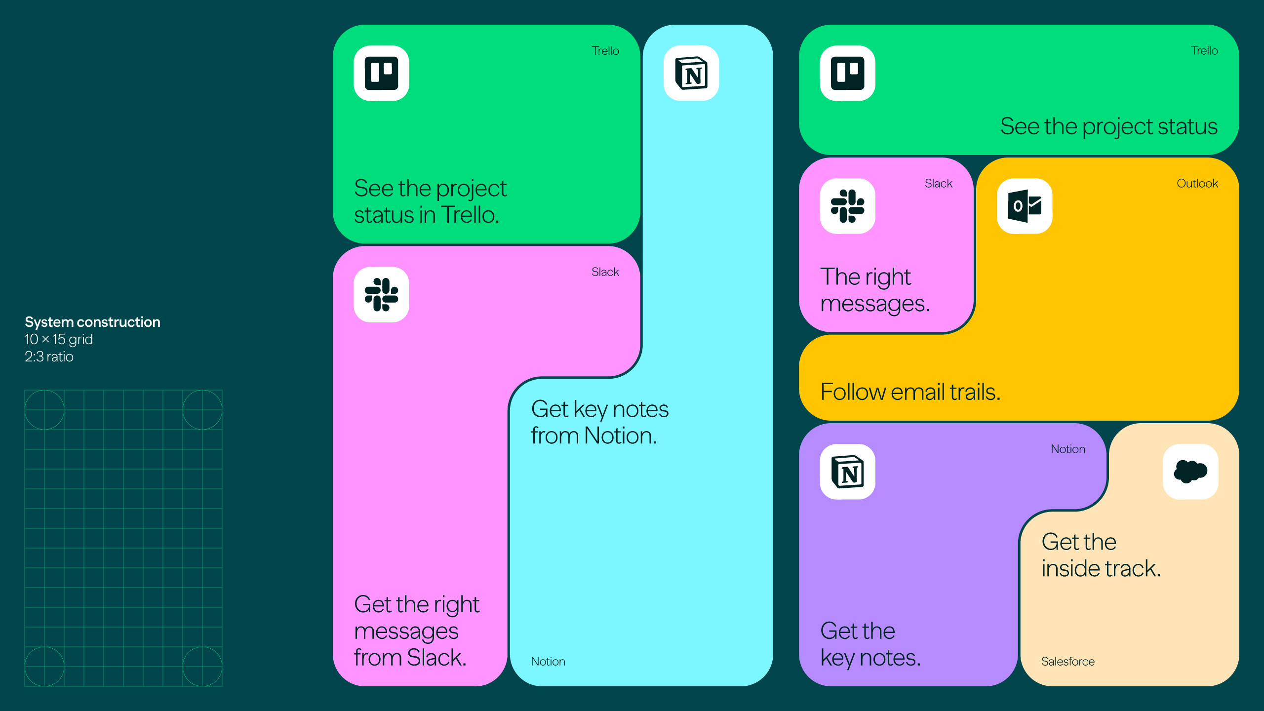
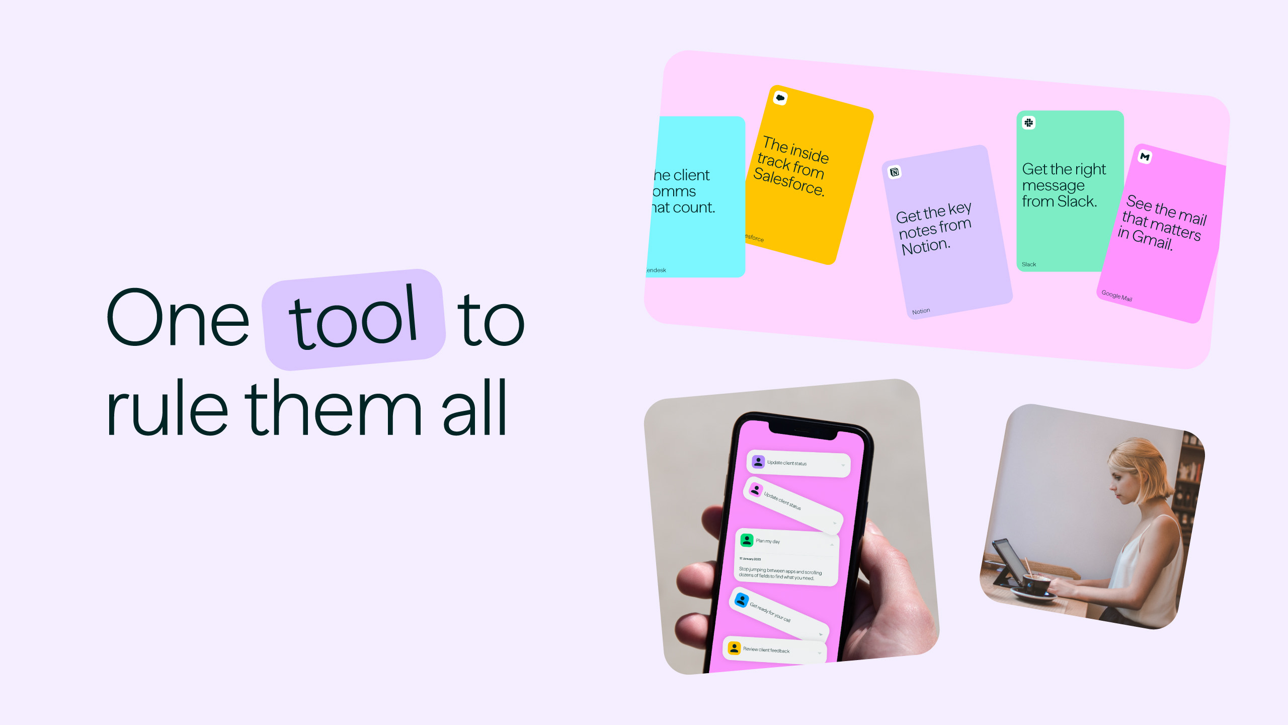
A tone of voice and brand pillars are rooted in ease of use and are user-benefit led. A visual style was created that compliments with soft inviting pastel colours.
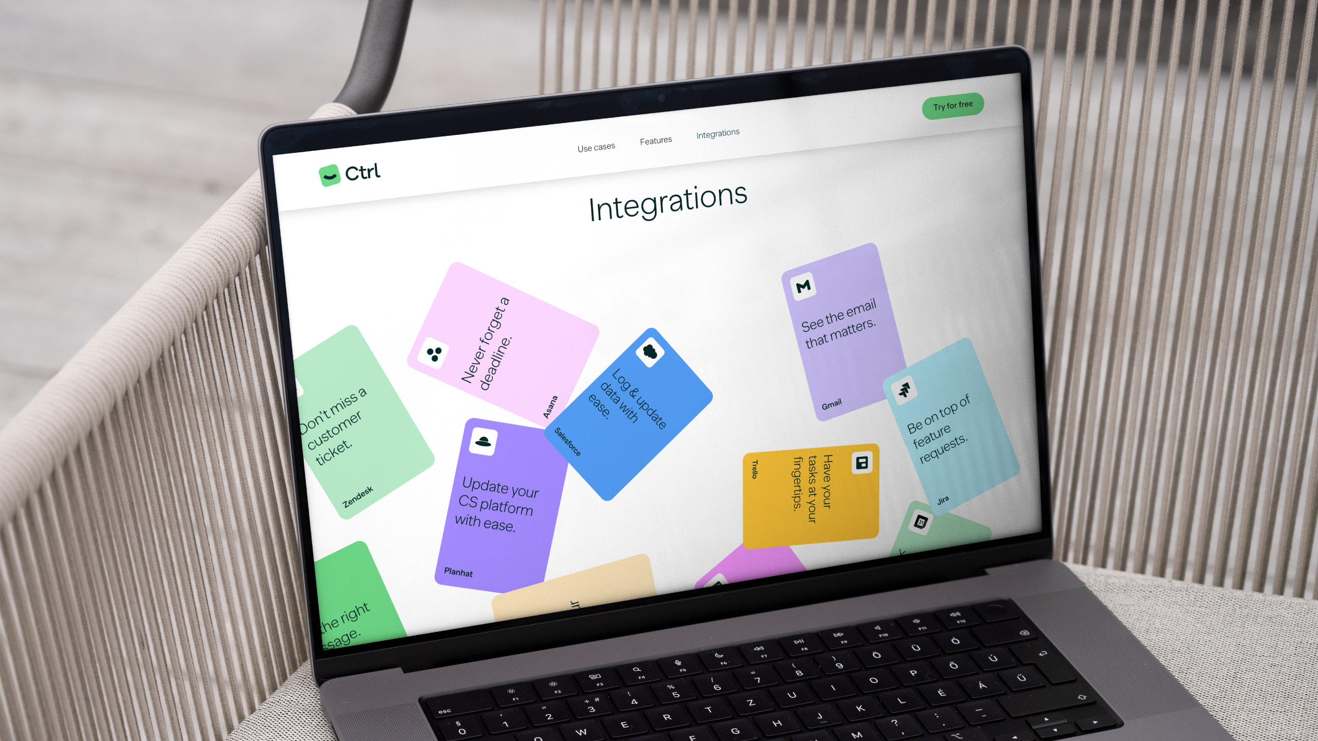
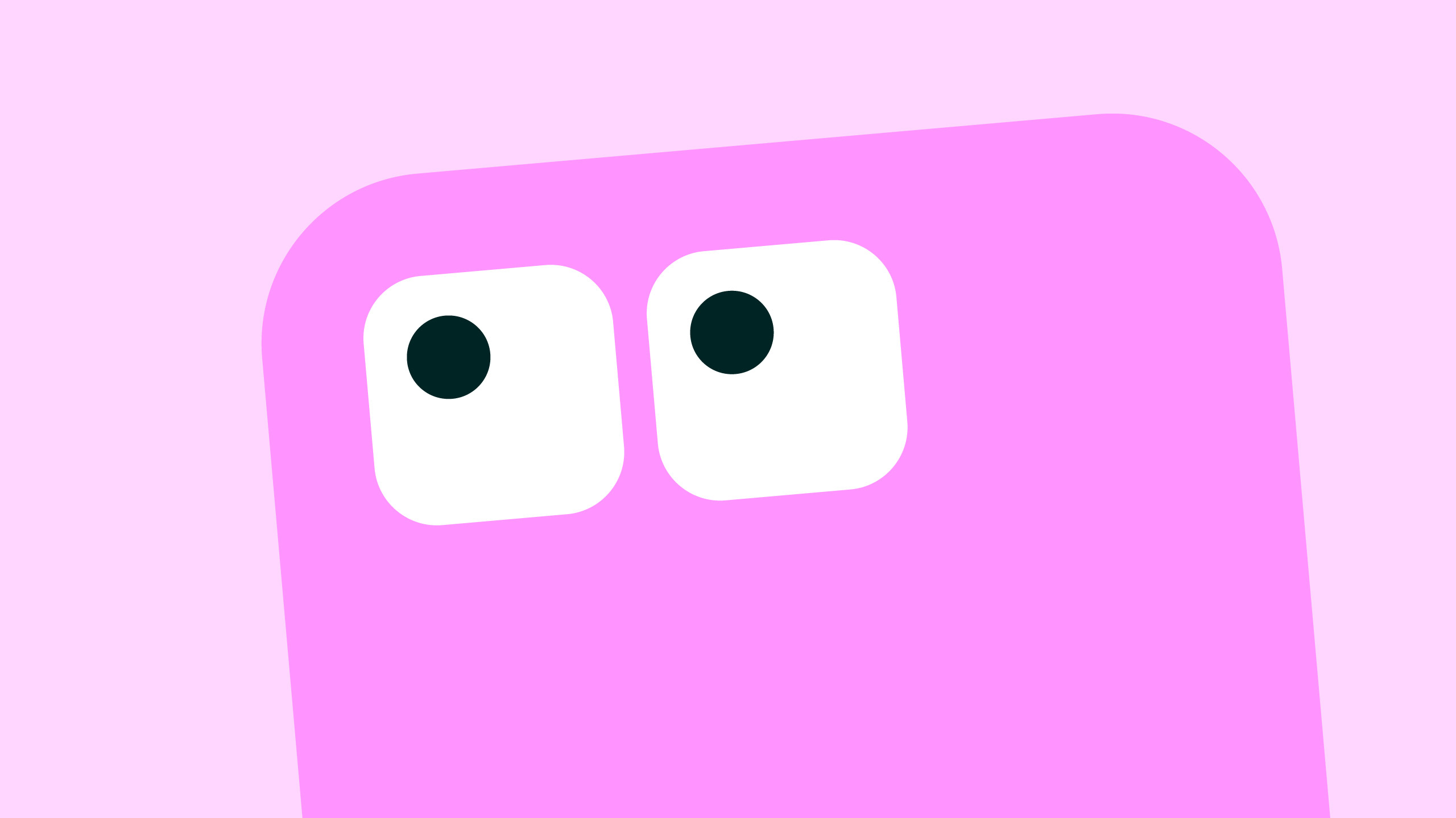
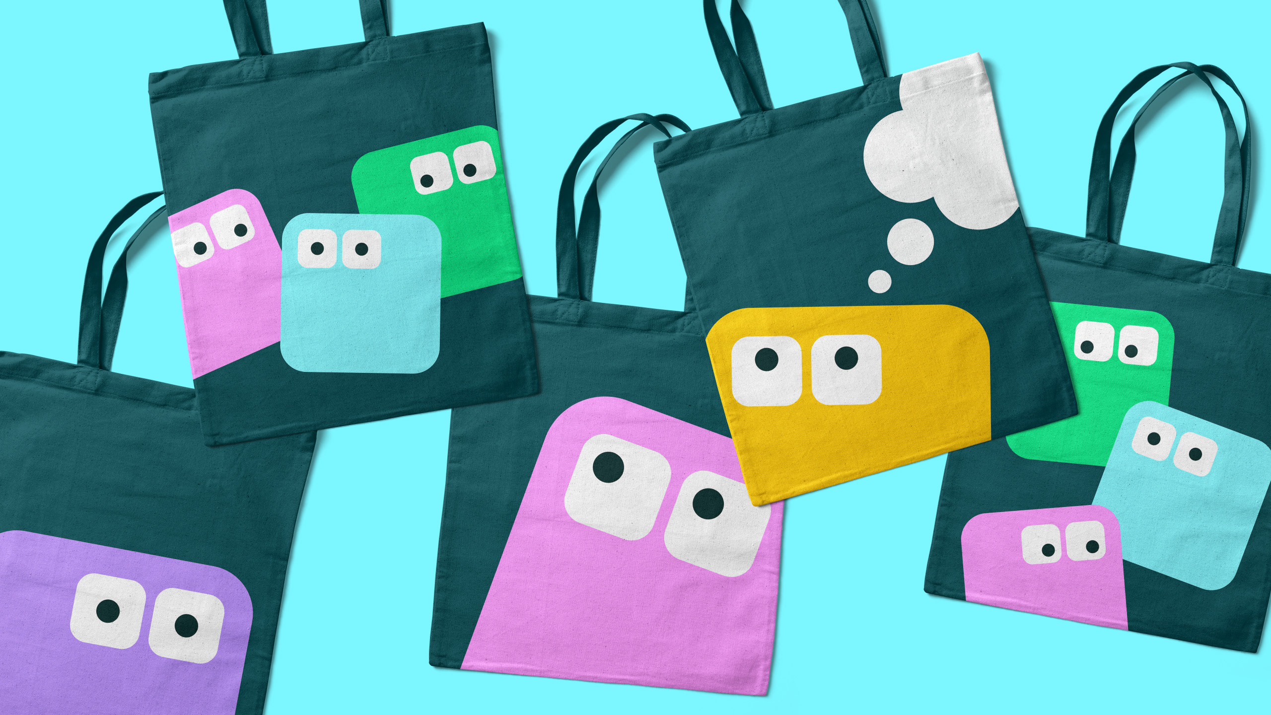
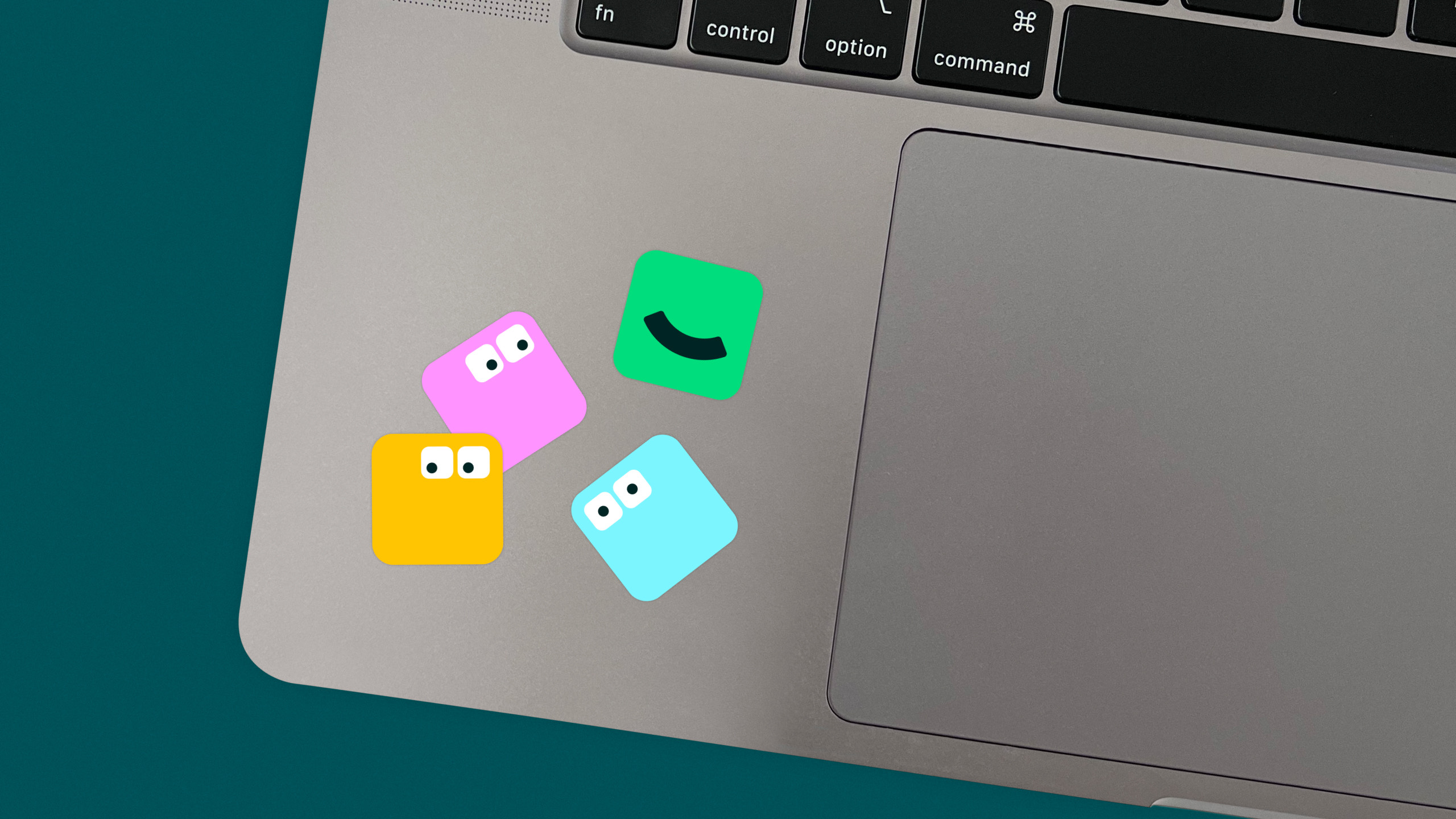
The website is an exciting and dynamic user-experience. We injected energy and a playful element with the addition of a happy big-eyed character, shaped like a keyboard key, who helps guide the user around the site.
The overall effect is a friendly and accessible self-serve experience. Just like the platform.












Let's talk about your growth ambitions.
