Banks Renewables, a leading land-based developer in renewable energy since 2006, announces the launch of its new name, OnPath Energy, along with its new brand identity.
OnPath Energy (OnPath) generates renewable electricity from its operating portfolio of eleven onshore wind farms to power UK households, businesses, and communities with clean, green, renewable energy.
The brand work reflects the company's commitment to growth and innovation, the UK's drive towards net zero. The launch includes a new website, which is designed to offer an enhanced user experience. The naming and brand work was created by London branding agency, Design by Structure.

The Meaning Behind OnPath
The chosen name, OnPath, reflects both the human-scale, community-led approach to the onshore renewables industry which includes onshore wind, solar photovoltaic, battery storage and pumped hydro storage. ‘OnPath’ conveys the idea of embarking on this journey together with local communities, local businesses, its people and the environment on a shared pathway toward securing a net zero future through renewable energy for all the UK.
A Bold New Logo and Identity
The name transition to OnPath Energy symbolises a significant step in the company’s journey towards continued innovation and growth in the onshore renewable energy sector. The new brand work marks a significant milestone in the company's evolution following its acquisition by Brookfield Asset Management, embodying the forward-thinking approach and dedication to pushing the boundaries of what’s possible.
This new identity aligns with OnPath’s vision for the future and mission to deliver innovative solutions that will support the UK's drive for net zero, improve the UK's energy security and in the long-term help drive down energy bills in our homes, businesses, schools, and hospitals. The logo design draws inspiration from the connections (denoted by the loop) OnPath fosters with the communities in which it operates and the onshore renewable energy sector.
A Creative Solution Rooted in People and Community
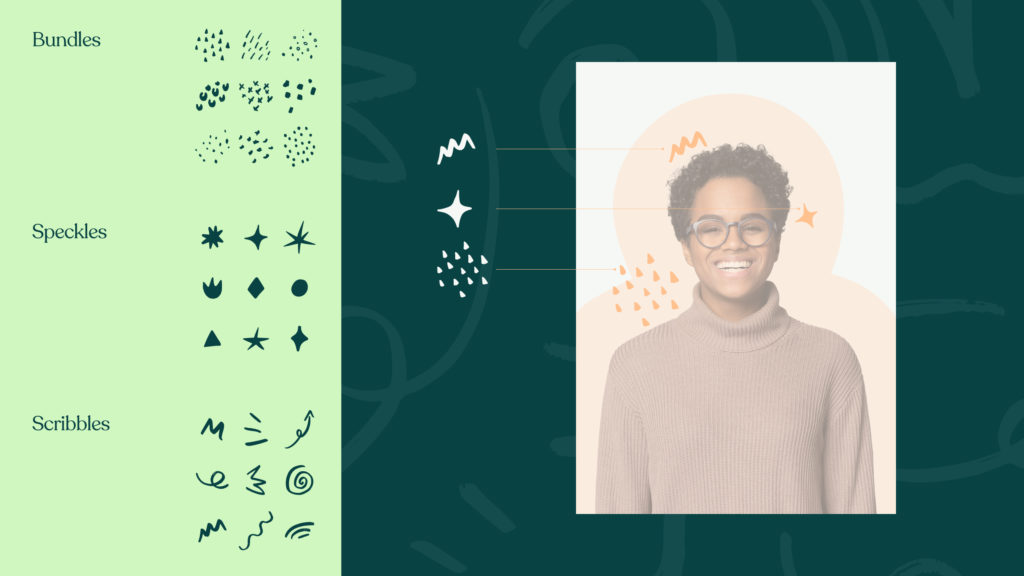
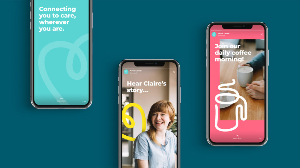
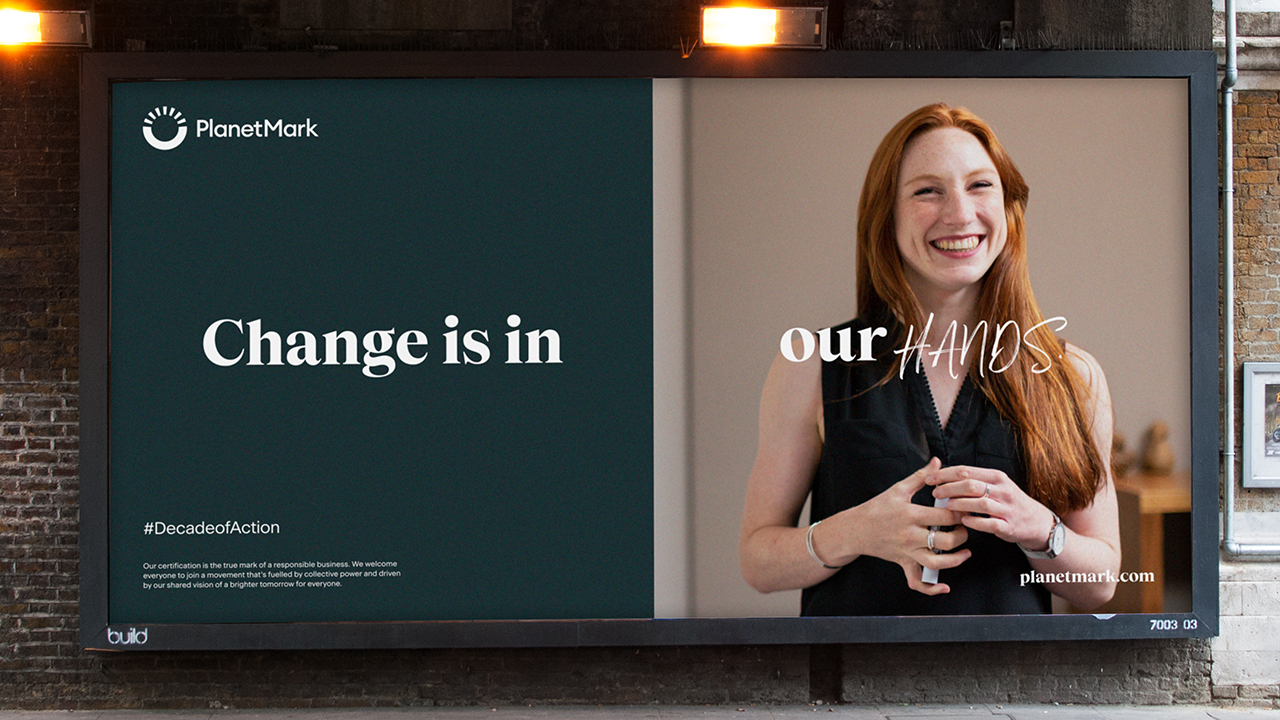
The creative direction for OnPath draws upon its defining strengths: its profound connection with people and its human touch in business practices. Therefore, the rebranding solution is anchored in 'people and community', setting OnPath apart in the onshore renewable energy sector. The creative strategy aimed to highlight the company’s green credentials in a fresh, non-cliché manner, shifting the focus from the typical imagery of wind turbines in countryside vistas and a sea of green colour palettes. Instead, Structure embraced warmer tones for the colour palette and a more people-centric approach in the photography, emphasising the benefits renewable energy development brings to people to explain the humanity behind sustainability rather than just the 'how' of it.

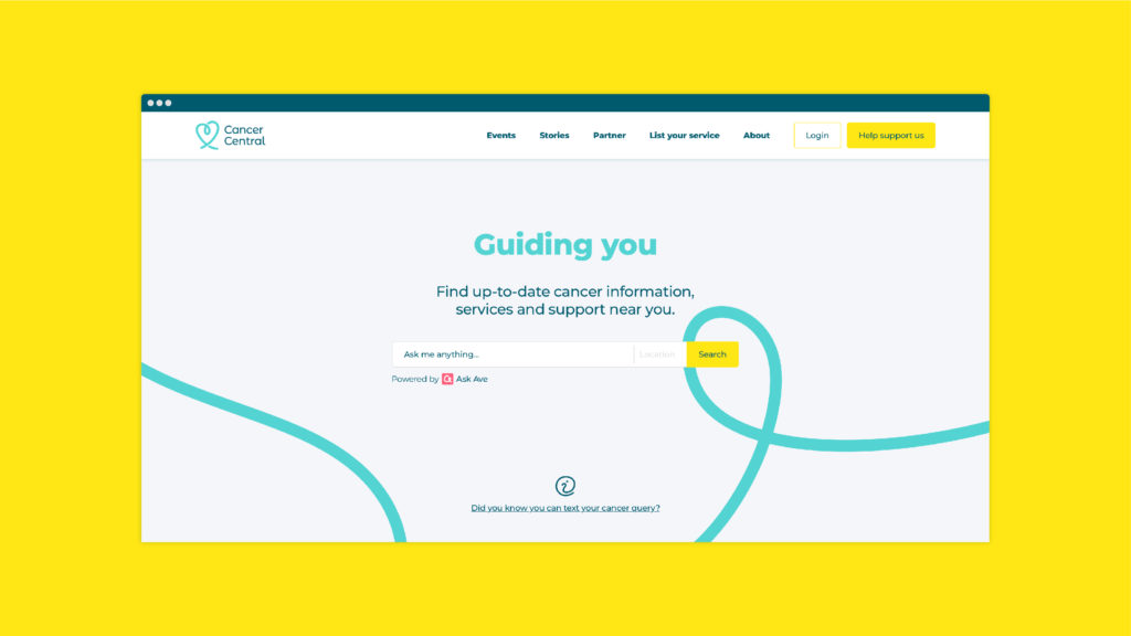
Enhanced Online Experience
As part of the project Structure was asked to design a website. The newly launched site serves as a crucial hub for the company, offering intuitive and user-friendly navigation to ensure swift and efficient access to pertinent information for key audiences – local and national government, landowners, local businesses and local communities.
Dotted throughout the website, the brand graphic draws inspiration from the natural world where the business operates. The topographic pattern serves as a constant reminder of nature's essence, deeply rooted in the core of OnPath’s operations.
Speaking about the work, Robin Winstanley, sustainability and external affairs manager, OnPath Energy, said, ‘Structure is one of the best agencies we have ever worked with: a powerful combination of great consultation skills, commercial acumen, and creative branding genius – they always deliver their work with commercial results in mind, and with great people at the centre of that delivery. Rebranding an energy business is not easy, not least because of the sheer volume of brands globally in this space, however, the process always felt natural, focussed, and most importantly helped us create a commercial niche that reflects our strengths and who we are as people.'


 .
.