–Re-energising the category with new branding–
Raise is launching its new name, identity, brand comms and website. The fintech, which operates within the recruitment sector, helps businesses grow with invoice funding, contractor management and admin support.
The business was co-founded in 2017 by Tim Bailey and Bea Stafford under the name 1PS, but the growth and ambition of the 2022 business demanded a name change – 1PS became Raise.
Raise represents the evolution of the business - showcasing a radically new and transparent approach to invoice finance. The new name is about the happy and positive experience Raise brings to its customers and users, supporting its ambition to be the leading provider of technology-enabled labour funding.
Brand work
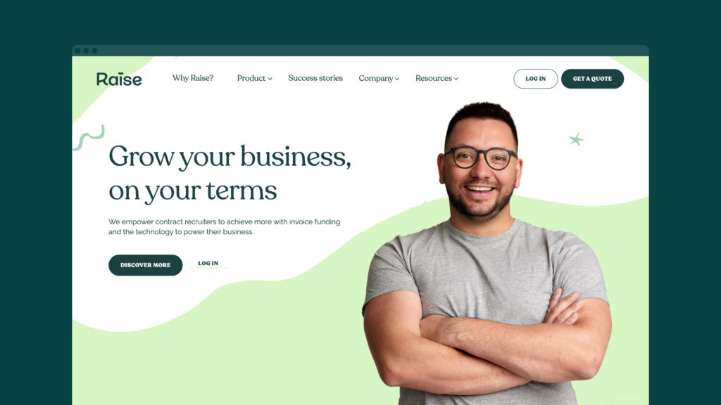
As part of its goal to be the leading provider of technology-enabled labour funding, the company approached Design by Structure to create a brand that injects character and personality into the category. The brand project included research, positioning and strategy, naming, identity, brand guidelines and a website – https://www.raisetech.io/why
The proposition line, ‘achieve more with Raise’, came from a deep dive into the business, the agency’s research revealed that within the category Raise is a distinctly different provider. It delivers a frictionless experience through its intuitive software and dedicated customer teams which benefits customers by freeing up their time, cash flow and headspace.
Speaking about the new brand work, Steve Cater, Vice President of Growth at Raise, said “It’s a very exciting time for us as we go from strength to strength in our mission to build the future of invoice finance. That excitement and our promise to the world has been captured beautifully in our new brand and sets us up perfectly to deliver on our vision.”
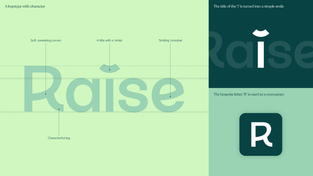
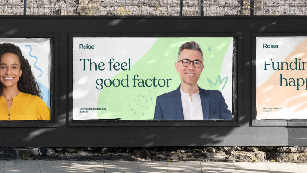
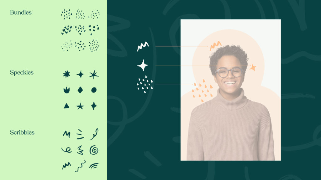
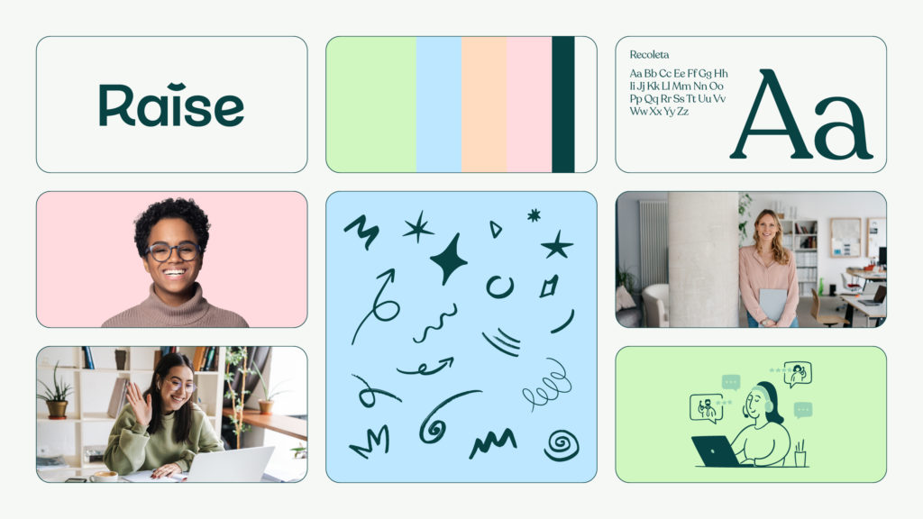
The creative solution is based on energy. Along with the new name is the new logo design, which features a ‘smiling’ dot on the I to project the positive impact Raise has on its clients – elevating and improving process. Every aspect, from the typeface to the icons and colour palette, injects a more joyful energetic side to the category, differentiating with bursts of green in a corporate ocean of navy blues.
The work rolls out this month.
Published by: Fara Darvill in Press Release
Comments are closed.